
British Aviation: The First Half-Century
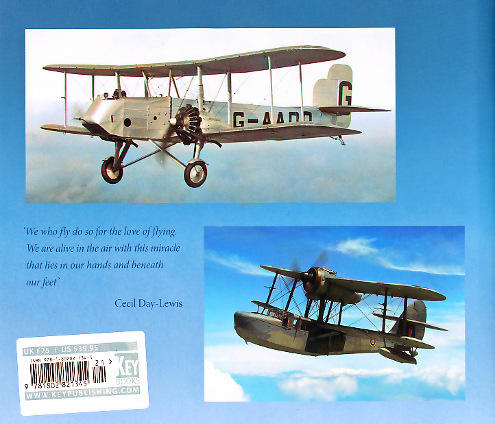
The British aviation industry produced a stunning variety of types in the half-century until 1953, from the famous Supermarine Spitfire and Avro Lancaster to the esoteric Planet Satellite and Armstrong Whitworth Apollo (Kudos to those who didn’t have to look up those latter two!). This new book from Key Publishing uses photos from the famous Aeroplane magazine archive to illustrate this wide variety, but does so through colourising those photos selected.
Author David Willis is well known for his aviation-related writing and he does a very good job with the concise, explanatory historical text and the informative and extensive photo captions.
The photos are, as stated, from the Aeroplane archive which guarantees quality, and they are an excellent selection. Aeroplane employed some of the best aviation photographers in the business in the thirties and some of the included images are quite outstanding. The choice of aircraft is also excellent, ranging as it does from the very famous to the quite esoteric and everything in between, a choice that well illustrates the inventiveness of the British aviation industry as it reached it’s peak in the late war years and into the early 1950s.
So far, so good.
The apparent point of this book, however, is the colourisation of the photos and that is my only issue with it. Colourisation of black and white images was of course a popular methodology in the early years of the century, right up until colour film became widely available, and relatively affordable, in the years immediately after the War. It saw a mini-renaissance in the 1980s with the colourisation of early black and white movies, though with very mixed results, and I’m afraid to say that is the case with this book.
Some of the images have been so well colourised that, on first glance, one might believe they are indeed actual colour images. Others, however, are very much throwbacks to the bad old days of the early 1950s when cheaper magazines (I’m looking at you, RAF Flying Review…) would often colourise some of their images to ‘keep up with the Joneses’ who really did print in colour.
Try as I might, I could not find in the text a stated rational behind colourising the images in this book, so I can only assume that ‘someone’ at Key thought it would be a good idea. In theory it was, but the execution of some of the images leaves a lot to be desired.
A good book with an interesting concept but flawed execution. Many thanks to Key Publishing for the review sample, and their continued support of IPMS/USA!

Comments
Add new comment
This site is protected by reCAPTCHA and the Google Privacy Policy and Terms of Service apply.
Similar Reviews